


Pitch by Pitch, Behind the Score
How one visual experiment uncovered the hidden momentum of a KBO game — batter by batter

Even as a baseball rookie, I knew the scoreboard wasn’t telling the whole story — so I turned to data, one plate appearance at a time.
Korea’s Most Popular Sport — and My First Season Watching It
If we’re talking about the most popular sport in Korea, it has to be professional baseball.
I’ve only recently started following the games in earnest this year, and unsurprisingly, I’ve already started charting things out — stats nerd habits die hard.
Now, my biggest weakness? I’m a total rookie when it comes to baseball.
I barely know the full rules, and I don’t really follow team histories or famous incidents.
But that lack of background actually turns out to be a hidden strength — at least from a data visualization perspective.
Because I’m not bound by the traditional ways of reading a game, I’m free to break structure and explore the data differently.
My Team of Choice: Hanwha Eagles
The team I’ve been watching most closely is the Hanwha Eagles.
Here’s a fun fact: their official YouTube channel actually has more subscribers than the LA Dodgers’.
That alone tells you something about the strength of their fan marketing.


What If We Ignored Innings?
The big idea I explored this time:
What happens if we ignore the traditional 1st to 9th innings structure in baseball?
Instead, I focused solely on batting order and the pitchers each batter faced.
I created a line chart showing how win probability changed depending on who was at bat and who was pitching — regardless of the inning.
It’s not perfect yet. I haven’t factored in pinch hitters or defensive shifts.
But for seeing how each pitcher affected win probability by batting order, I think the format works surprisingly well.
The Chart: A Cycle Plot of Win Probability
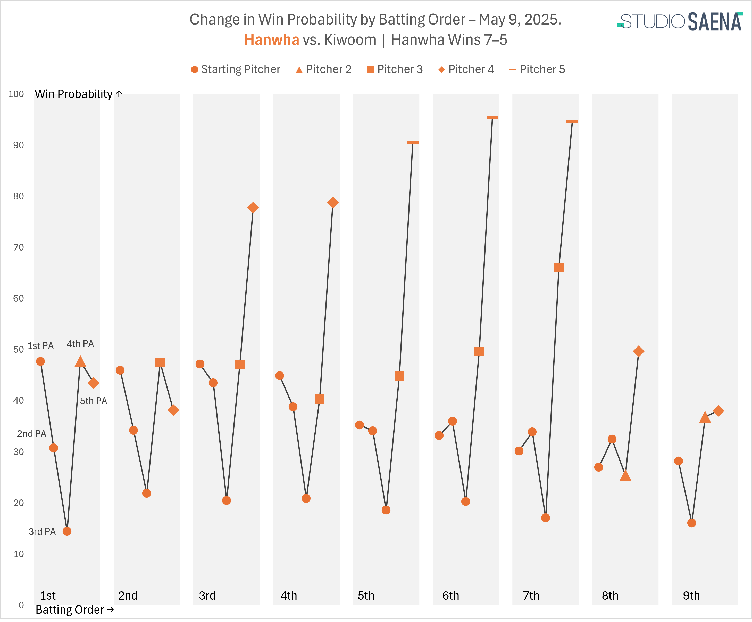
The chart is structured as a cycle plot, with each row representing a batter in the lineup and their sequential plate appearances.
And there’s an interesting trend:
From the 3rd to the 7th batter, win probability climbs significantly as the game progresses.
Crossing the 50% line is especially meaningful — it usually signals the momentum tipping toward a win.
So it’s likely something dramatic happened around the 3rd batter’s 5th plate appearance.
In contrast, the 1st, 2nd, 8th, and 9th hitters struggled against the starting pitcher, dragging win probability down early on.
But by the end of the game, they’d managed to bring things back to roughly where they started.
The Other Side: Pitching Strategy Under Pressure
From the opposing team’s perspective, the game tells a different story.
Their starting pitcher held things steady, keeping win probability in their favor.
But by the third pitching change, that control started to break down.
From that point on, the new pitchers seem to have struggled to contain the lineup, especially in the middle batting order.
A Different Lens on the Game
This kind of chart lets us view the game not by time (inning), but by batting cycle.
That shift in perspective surfaces patterns that would be hidden in traditional inning-based scorecards.
I’m still just getting started — both as a baseball fan and as a data observer of the game.
But I’m starting to think: sometimes being a beginner helps you ask different questions.