
Mastering the Bullet Chart: Visualizing Progress & Gaps
Data Visualization for Effective Problem-Solving in Korean Summer Disaster Recovery

Understanding the Data Behind the Visual
Today, I'm introducing a powerful new chart. It excels with data needing to show current status, goals, and background context—a style often seen in professional settings.
For this example, I've used data from Gemini, focusing on Korea. While all nations face disasters, Korea experiences particularly heavy rainfall during July and August. Although the monsoon patterns have shifted, rain damage remains a consistent challenge.

How would you typically visualize such data? If only current achievement and target matter, a large number for the target and a simple bar chart for current status might suffice. But what if the background also needs to be visualized?
🤔 This is the ongoing challenge for information designers: effectively visualizing ever-increasing information.
Why Bullet Charts Excel for Disaster Recovery
During disasters, focus shifts to the extent and timeline of recovery. Bullet charts best represent this progress.
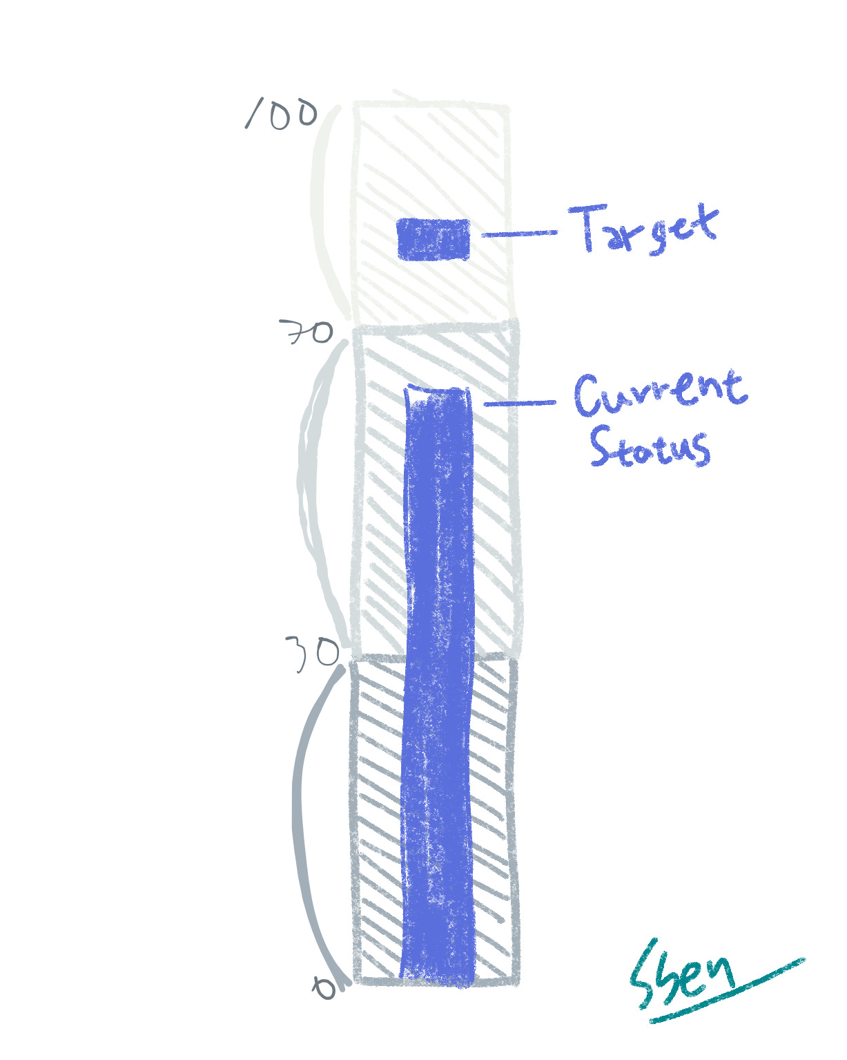
My simple chart approach uses 0-30, 30-70, and 70-100 as defined criteria, correlating to "Poor," "Normal," and "Favorable." The long dark bar shows current achievement, while the short bar above it represents the target.
Vertical bullet charts, often made with stacked bar charts in PowerPoint or Excel, build data cumulatively. For instance, "Normal" is 70 minus 30, and "Favorable" is 100 minus 70. This explains why segments may share colors with corresponding values.
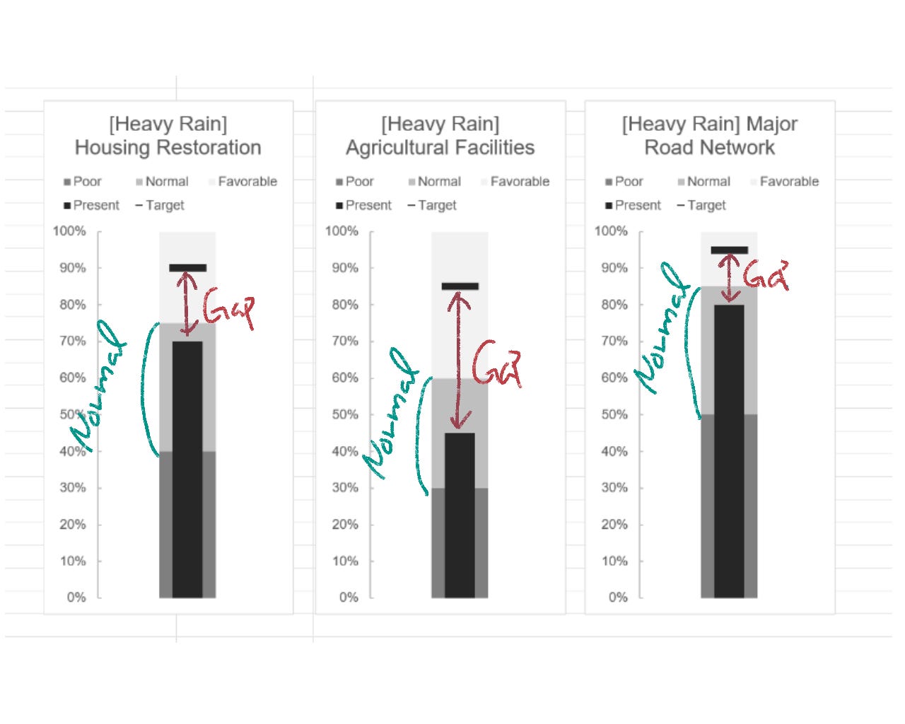
Identifying the Gap: Present vs. Target
When interpreting this chart, I'd first look at the difference between the current status and the target, then at the intermediate progress.
This difference, between what's achieved and what's not, is what we call "the problem." Clearly defining this problem is vital for effective disaster recovery.
A Glimpse into Korean Summer
Korea is currently in full summer swing. High humidity and soaring temperatures make it feel like a sauna. If visiting Korea soon, prepare well for the heat!
I'll be back with more useful charts and Korean data in my next post. Stay tuned!