

Today, I will introduce disaster-related data and share a case study on data visualization. In South Korea, wildfires frequently occur from this time of year through spring. Similar to the wildfires that caused a stir in California late last year, there is growing concern that abnormal weather patterns will lead to an increase in wildfire occurrences.
What insights can we gain from past wildfire incidents? This newsletter will explore wildfire-related data, the process of refining and organizing it, and the tools used for visualization.
Where to Find Wildfire Data in South Korea
In South Korea, wildfire-related data can be found on several official websites, including the Korea Forest Service. These datasets provide various details such as the occurrence and containment dates, affected area, and specific locations.
Since the dataset covers a long period, significant preprocessing was required in the initial stages. To focus on recent major wildfires, I narrowed the timeframe to 2022–2024 and selected specific regions: Samcheok, Goseong, and Gangneung in Gangwon Province.
It is important to note that this level of data is insufficient to determine specific causes. Instead, the primary objective should be to understand the overall trends and current wildfire situation.
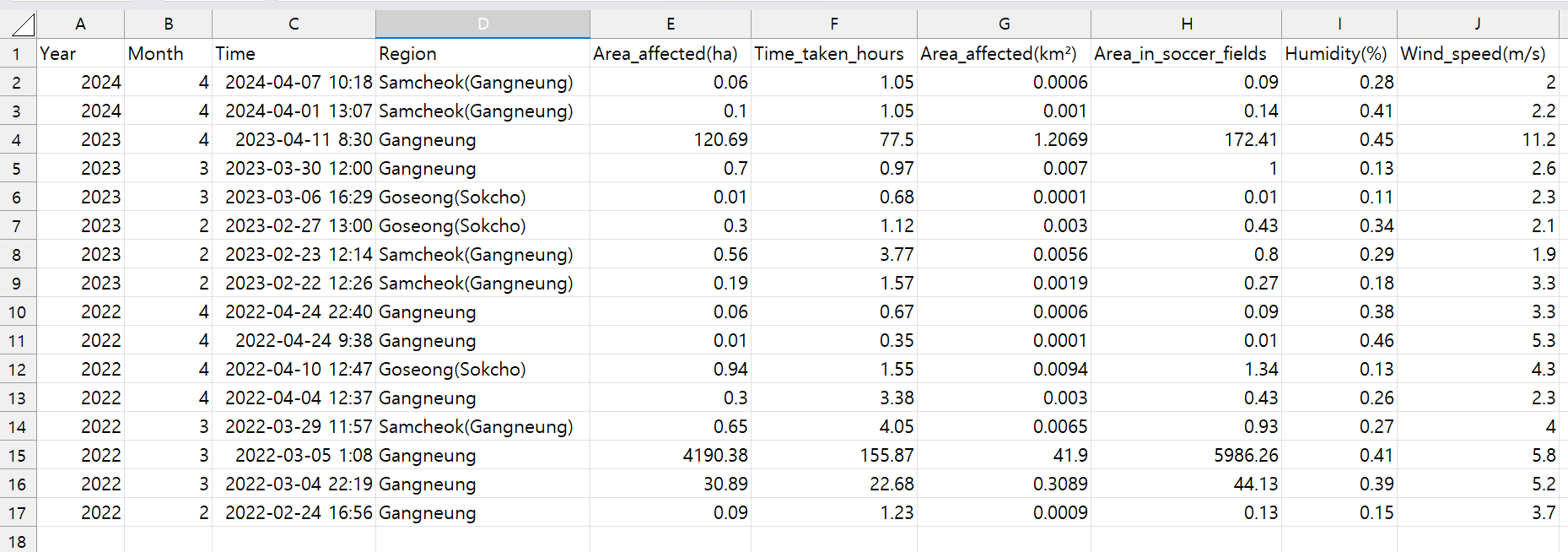
I incorporated some assistance from GPT while organizing this summarized dataset. Notably, I added Time Taken (Time_taken_hours) and Affected Area in Soccer Fields (Area_in_soccer_fields).
Since most damage area measurements are in hectares (ha), they can feel somewhat abstract. To make the data more intuitive, I converted the affected areas into the equivalent number of soccer fields—a unit often used in news articles for better visualization.
The last two columns, Humidity and Wind Speed, were manually added using data from the Korea Meteorological Administration. When dealing with a manageable dataset, I find it feasible to supplement certain data points manually.
There has been ongoing discussion about how changes in wind speed and humidity—key indicators of abnormal weather patterns—are contributing to the increasing frequency and duration of wildfires. I wanted to examine how significant this influence actually is. Since wildfire datasets typically do not include weather conditions at the time of occurrence, I incorporated meteorological data to bridge this gap.
Visualizing Data with a New Tool: Observable
I primarily use Excel and PowerPoint for data visualization, but there are certain types of visualizations that are difficult to create with these tools. A key challenge arises when dealing with large datasets or complex categories that require flexible design adjustments. Another limitation is the lack of interactive features, such as displaying additional information when hovering over specific data points.
To address these challenges, I’ve been exploring additional tools that offer more flexibility. Today, I used Observable, a platform that primarily utilizes JavaScript and D3.js for generating visualizations. Since the focus isn’t on introducing the tool itself, I’ll simply share the final visualization and how the graph was created.
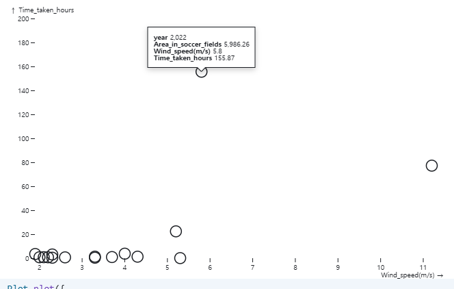
This scatter plot visualizes the wind speed (x-axis) and wildfire duration (y-axis) for each recorded wildfire. The highlighted data point with a speech bubble represents the wildfire with the longest duration among all incidents. It also ranks second in wind speed and has an affected area equivalent to 5,986 soccer fields, making it one of the most significant events in the dataset.
With this type of visualization, users can hover over data points or adjust specific axes to explore different wildfire patterns in detail.
While this graph alone does not establish a direct link between extreme weather conditions and wildfires, it does highlight cases where high wind speeds contributed to prolonged wildfire durations. If additional variables—ones I haven't explicitly mentioned here—were incorporated into the graph, new insights could emerge.
When major incidents occur, the immediate focus is often on the narrative surrounding the event, which is essential for understanding the human impact. However, from a broader perspective, data analysis is equally crucial for forecasting future risks and improving preparedness. This is why I continue to examine various incidents through a data-driven approach.
My Observable : https://observablehq.com/d/d16e6fd89bb44711